MyCare Virtual App
One of my primary responsibilities at AMC Health is pushing for continual improvement of the patient-facing MyCareVirtual App. Patients use the app to take biometric readings, submit surveys, communicate with their care team, and view educational content as part of their remote patient monitoring programs.

The app screens showcased here are from the screens that were made available to the public on the iOS App Store.
Project Details
Context
Project at AMC Health (full-time employment)
Target Users
AMC Health’s mobile patient population, the majority of which are senior citizens
My Role
Director of User Experience
Timeline
The project spanned 2 years and is ongoing:
User research- 2 months
Design and development- 1 year 10 months
Project Overview
The MyCare Virtual App is a patient-facing application developed by AMC Health to assist patients (many of which are seniors) in managing their health remotely. The primary objective of this ongoing initiative is to make the app more geriatric-friendly, addressing the unique needs and challenges seniors face, such as poor eyesight and limited tech-savviness. Over the last two years, I have helped guide significant improvements, focusing on usability and accessibility to ensure a seamless, supportive experience for patients. The project includes continuous user research, UI design, and collaboration with the mobile development team to enhance the app's functionality and user experience.
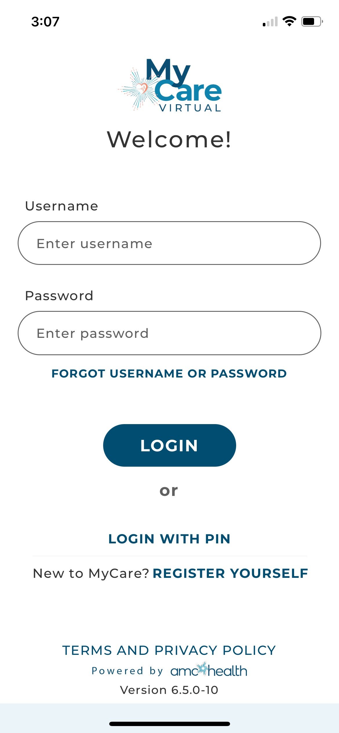
The Login screen, in username/password mode. Patients can also use quick login methods- PIN or biometric (on supported devices).
My Role and Approach
As the Director of User Experience at AMC Health, I have been the driving force behind the MyCare Virtual App's redesign and improvement efforts. Utilizing design thinking and working in tandem with an Agile mobile development team, I spearhead the UX strategy, conduct user research, design UI mockups, and create detailed Jira tickets for implementation. Collaboration is key, and I work closely with both the Product and Mobile development teams, as well as occasionally guiding a UX design contractor. This dynamic approach allows me to propose and implement changes swiftly, ensuring the app evolves to meet user needs effectively.
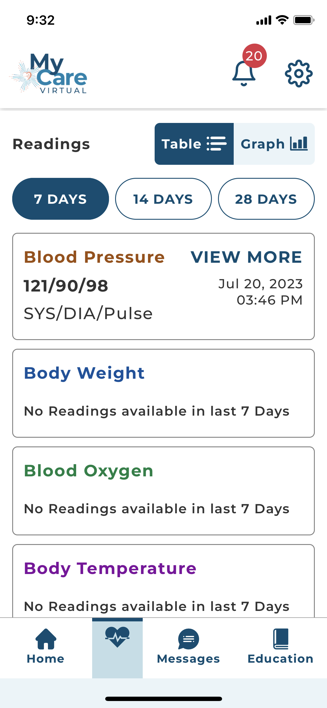
The Readings screen, where patients can review their historical vital readings at a glance, either in table or graph form.
Challenges & Solutions
One of the significant challenges encountered during this project was meeting WCAG color contrast requirements while adhering to the company's branding guidelines. To overcome this, we employed a color contrast accessibility checker tool, meticulously adjusting each screen to ensure compliance while staying on brand. This painstaking process was essential to enhance the app's usability for seniors, who often face visual impairments, thereby making the interface more accessible and user-friendly without compromising on brand identity.
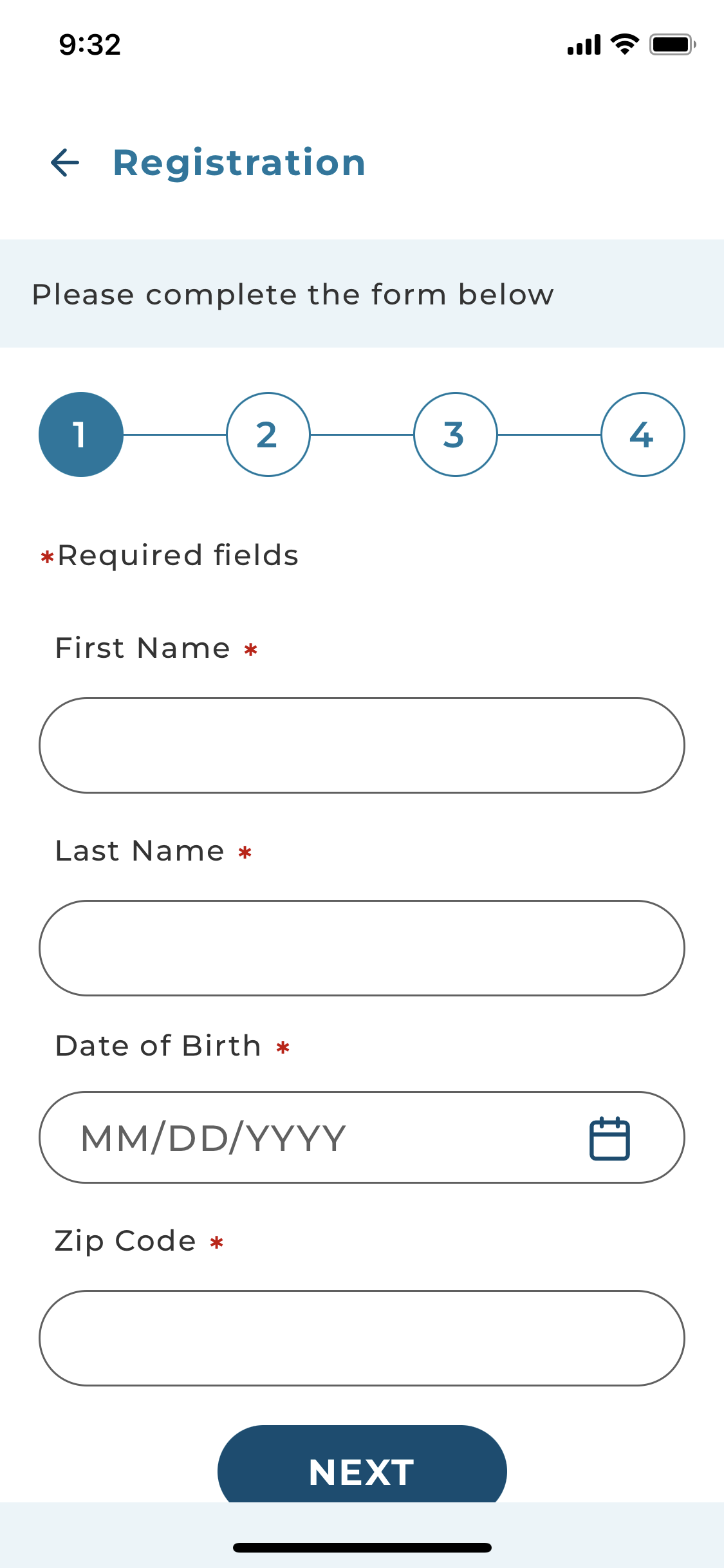
The first of the 4 screens of the self-service registration flow. As soon as patients exist in AMC Health’s system, they are able to register themselves to start using the app.
Achievements
The most notable achievement has been a comprehensive overhaul of the app's UI. This includes implementing larger text, bigger buttons, an improved user flow, clearer instructions, and better color contrast for accessibility.
This design overhaul was largely informed by user interviews, where I connected with people new to our app to understand the pain points and happy paths from a new user’s perspective. These interviews informed dozens of Jira tickets for new functunality, improving and adding features to make the app even more user friendly, especially for older users.
When the overhaul was released, the positive reception from the Sales team highlighted the modern and user-friendly design, while the Support team appreciated the enhancements that made the app easier to navigate for patients. Additionally, the seamless integration of Continuous Glucose Monitoring (CGM) devices for diabetic patients was a significant milestone, demonstrating our ability to incorporate new features harmoniously into the existing UI.
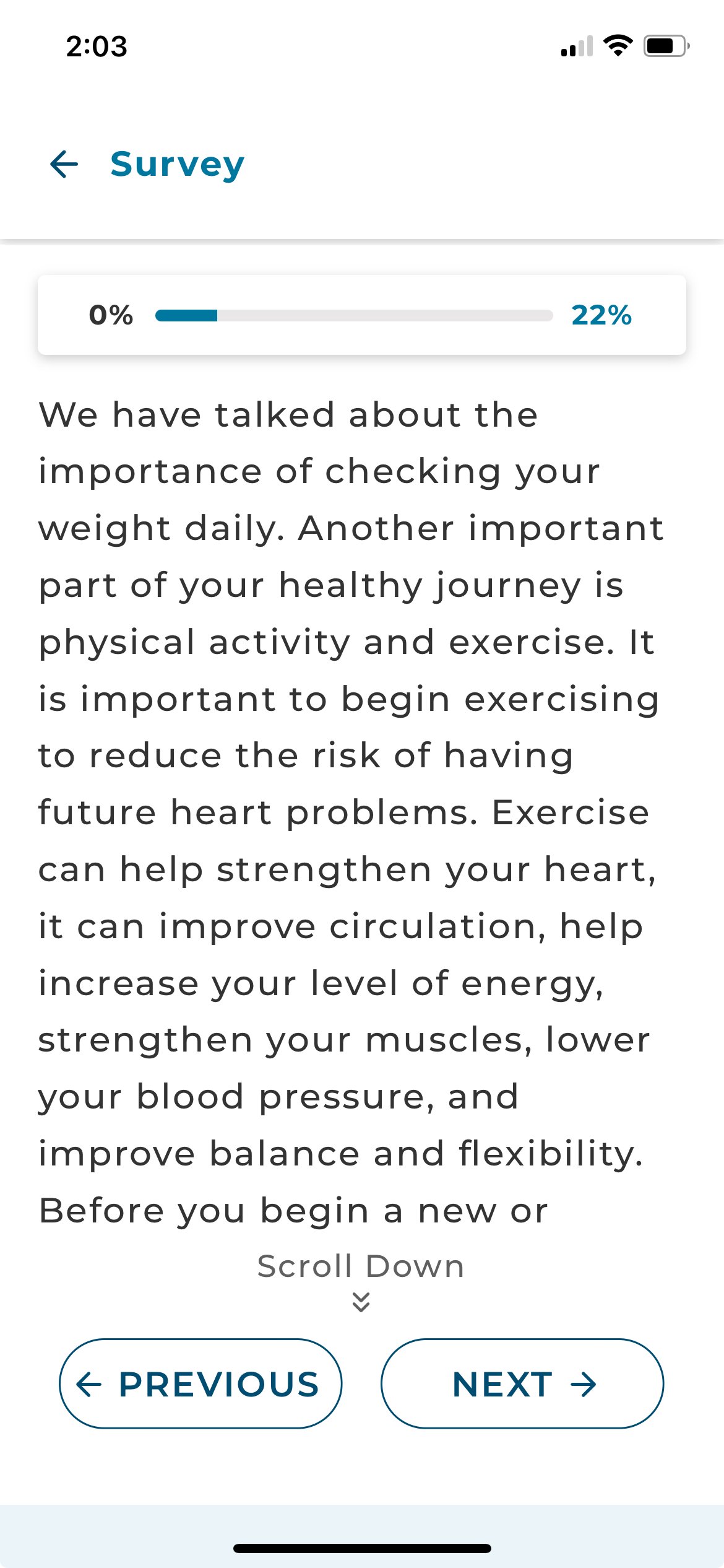
A screen from a survey in the app. Surveys can help educate patients, check in on how they’re feeling, or both. Some also include educational videos.
Screens and Visuals
The MyCare Virtual App boasts several intuitive and user-centric screens. Key highlights include:
Registration: A streamlined four-step process that allows for self-service setup for eligible patients.
Vital Readings Page: Enables users to easily take Bluetooth readings or submit manual readings, praised for its usability in user interviews.
Survey Screen: Allows patients to answer health-related questions to keep their care team up to date on their condition. Some surveys also provide educational content, to help patients better manage their conditions from home.
Education Section: Provides access to educational videos tailored to the user's condition.
Conversation Screen: Facilitates messaging between the user and their care team.
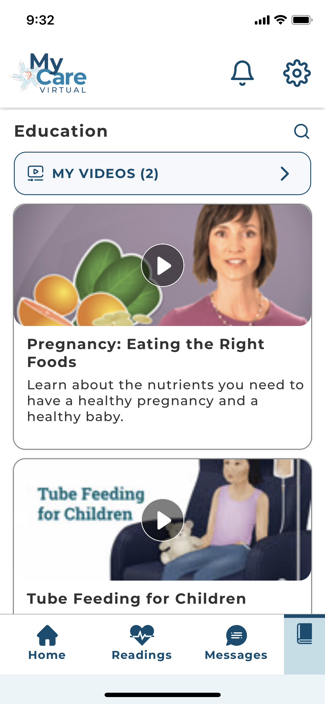
The Education main screen. The available videos change based on the patient’s condition(s). Users can save favorite videos to the “My Videos” section for easy access later. I helped design the addition of captions and transcripts for the videos, for improved accessibility and easier usability in loud environments.
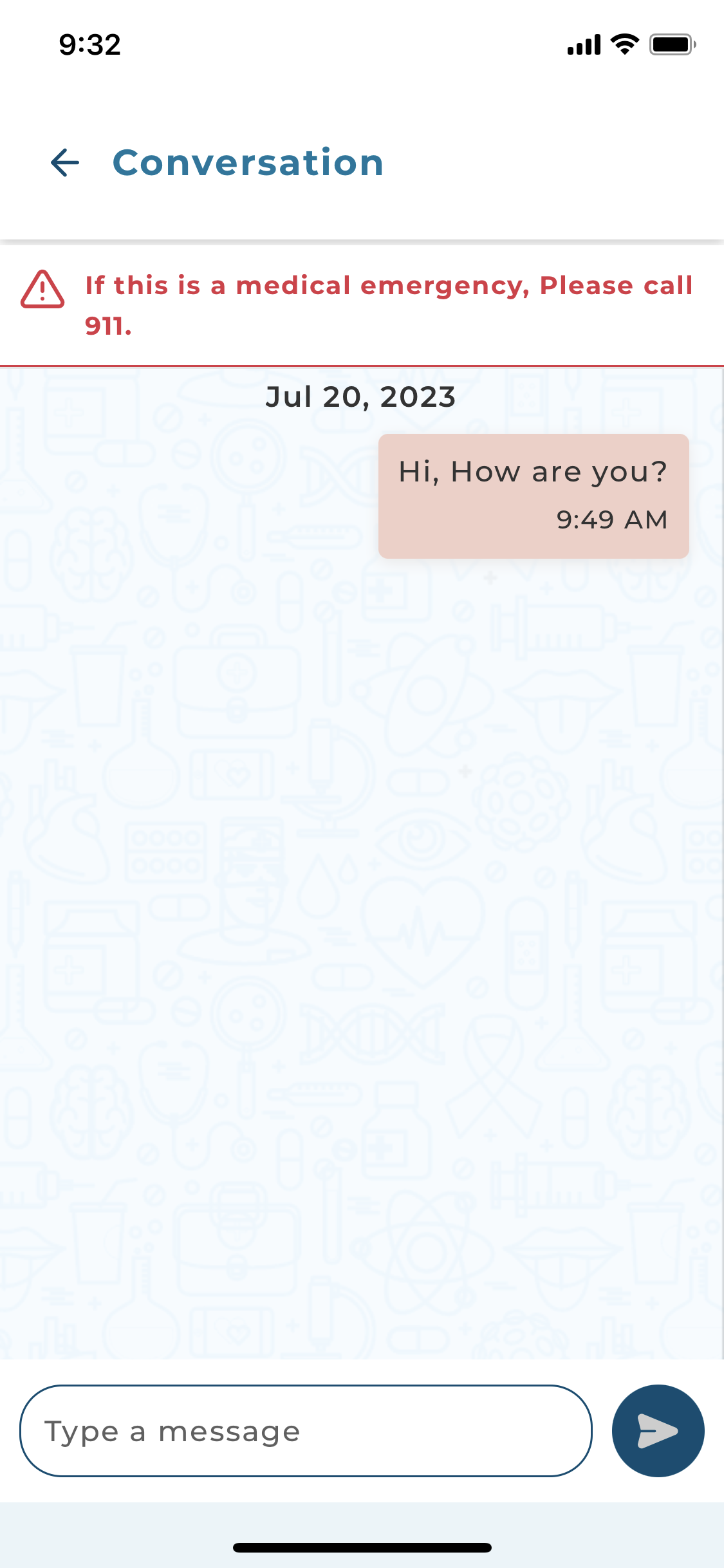
An example of a Conversation screen. Patients can communicate with their care team by sending messages in a style similar to that of SMS texting.
Conclusion
The continuous improvements to the MyCare Virtual app underscore its commitment to enhancing usability for patients, making it more accessible and geriatric-friendly. This project has been a significant learning experience, broadening my understanding of accessibility requirements and their implementation. As we move forward, the ongoing objective remains to refine the app further, integrating new features and maintaining alignment with AMC Health's goals, ensuring it remains an invaluable tool for our patient population.