A Cultivated Nest Redesign
A Cultivated Nest is a lifestyle website dedicated to helping users live well on a budget, offering valuable content on recipes, DIY projects, and frugal living tips. Following a site audit, the owner recognized the need for a significant design overhaul and hired me as a freelance UX designer to spearhead the redesign.
Project Details
Context
Freelance Work
Target Users
Women, primarily aged 40-60 years old
Stay-at-home moms
Child-free or empty nester homemakers
My Role
UX researcher and UX designer
Timeline
The project took 8 weeks to complete:
Competitor analysis: 2 weeks
Information architecture/user flow design: 2 weeks
Redesign on staging site: 3 weeks
Launch, and final tweaks: 1 week
Initial Consultation
I began by speaking with Manuela, the owner of the site, about her vision for the redesign. A Cultivated Nest has been around since the early 2000s, originally on Blogspot, so she had been through a few redesigns by the time I came along. Her main concerns were related to site navigation, bounce rate, and the site design being outdated.
Pain Points
Through the consultation and my own investigation, I identified the following pain points:
Outdated design may have been driving away potential readers.
Outdated design ma have been discouraging social shares.
Too many categories and subcategories, so the information architecture was not improving the users’ experiences.
Manuela was considering adding free and paid downloads to the site, so she needed the site’s architecture to be able to support that without further cluttering the main navigation.
The site wasn’t mobile responsive, reverting to a very plain, simplified theme on mobile.

A Cultivated Nest’s old home page UI.

A Cultivated Nest’s old post page UI.
Competitor Analysis
With these pain points in mind, I began running a competitor analysis to see what some of the leaders in A Cultivated Nest’s niche were. While A Cultivated Nest is focused on frugal living, it is not a finance website. So instead, I focused more on DIY websites, recipe websites, and parenting websites. These included personal blogs and magazine websites.
Analysis Results
The site needed an introduction area, showcasing several topics at once, to encourage casual visitors to stay.
The navigation categories needed to be consolidated.
The search bar needed to be moved to the top of the page for a better user experience.
The current sidebar was messy, and distracted from the post content.
The current color scheme was a bit dull.
The current logo looked old-fashioned.
The header text used a handwritten style font that may not have been easy for everyone to read.
There was not a clear enough typography hierarchy between the post headers and all the other text on the text page.
When ads were allowed to run, the many colors of the text, icons, and other graphics on the page made the page look messy.
Information Architecture
I then developed a user flow chart to help visualize the new information architecture for the site. This was partially informed by my competitor analysis, and also by the suggestions of a third-party blog audit Manuela had gotten done before hiring me. The end result consolidated the number of main navigation items and streamlined the subcategories. I also decided to move content like the About and Privacy Policy to a secondary navigation at the very top of the page, to make the main navigation clearer.

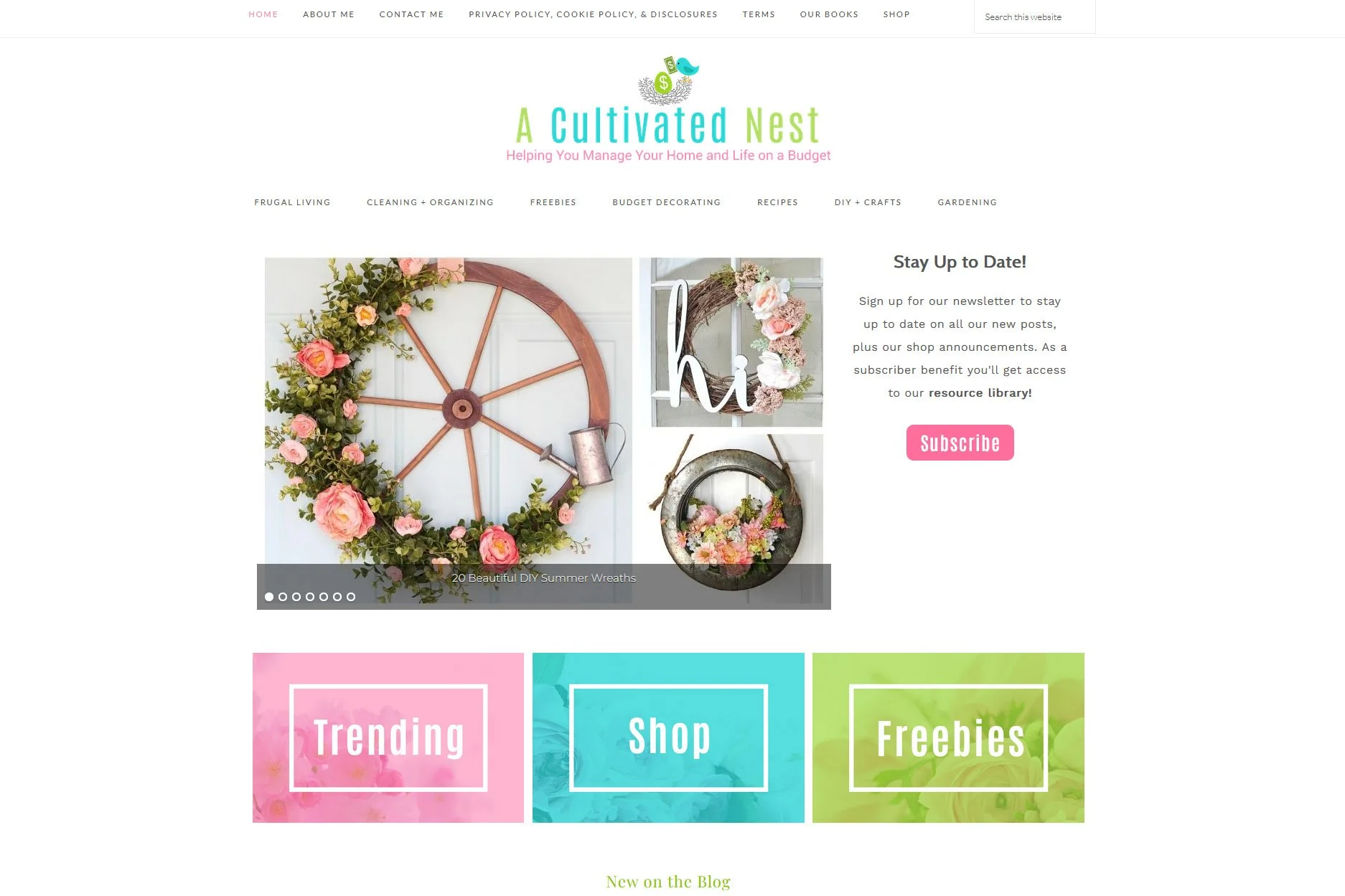
The new home page UI I designed for A Cultivated Nest.
Redesign
I worked with Manuela’s WordPress developers to create a staging version of the site. On this site I could design directly in WordPress, with all the same content being pulled from the database, but with no users able to access it. I was also able to add and remove plugins to try them out, without affecting the main site’s plugins. This also allowed me to work through plugin conflicts with the WordPress developers, and find which plugins simply could not be used, and which could be utilized with simple workarounds. I frequently communicated with Manuela, getting her feedback on updates to the design, and finding the perfect blend between her vision and the user’s needs. I also redesigned the logo, and helped guide Manuela toward a brighter, more cheerful version of her original color scheme. And the base theme I chose also was mobile responsive, something that was lacking in the original version of the site.

The new post page UI.
Launch and After
When the site redesign was finished, the WordPress developers published the staging site over the original site. The launch overall went smoothly, with a few plugin issues that I communicated with the developers to fix.
Over the next year I would also help add an ecommerce shop and free resource library. As intended, these fit in seamlessly with the redesigned site’s information architecture. In fact, the free resource library was simply added as a subcategory to the existing Freebies category (which originally just directed users to posts about free printables).
I helped make other changes to site over the years, as well, like helping adjust the interface to guide more users toward the shop. And as client-facing plugins have come and gone because of lack of support or security issues, I advised on those as well, as seen in the floating social share icons now present on the post pages (seen in the second screenshot below).
As a result of the redesign, A Cultivated Nest saw the site’s bounce rate decrease by 7%.

Next Steps and Recommendations
A website redesign is never truly finished. As trends change and user expectations evolve, it will be important for A Cultivated Nest to continually pivot to keep providing the best user experience. To help inform A Cultivated Nest on how large those pivots need to be, I would recommend:
Running a user survey to find major pain points or missing features in the existing design.
Running a few remote moderated interviews with users, to better understand any pain points discovered in the survey, and to better understand what users think and feel as they navigate the site.