ACN Email Newsletter
A major source of A Cultivated Nest’s traffic is email newsletter click-throughs. I was tasked with analyzing and redesigning the email newsletter template to improve open rates, click throughs, and social shares.
Project Details
Context
Freelance Work
Target Users
Women, primarily aged 40-60 years old
Stay-at-home moms
Child-free or empty nester homemakers
My Role
UX researcher and UX designer
Timeline
The project took 7 weeks to complete:
Newsletter analytics analysis: 2 weeks
Email template design: 1 weeks
Launch and further analysis: 4 weeks
Initial Consultation
I began by speaking with Manuela, the owner of the site, about the current email newsletter and her goals for the revised newsletter. The original newsletter ran on Feedblitz. Manuela was planning to move to Mailerlite, which provided more features and customization possibilities.
Pain Points
Through the consultation and my own investigation, I identified the following pain points:
Outdated template, very simplified and not aligned with the brand feel or style.
Impersonal, auto-generated approach to each newsletter.
Weekly posts automatically populated based on RSS feed, so not customized to reader trends.
Newsletter subscribers were assumed to have the same interest as social media followers, but this had not been verified.
Overall, open rates, click-throughs, and social shares from subscriber visits needed to be improved.
Newsletter Analysis
With these pain points in mind, I began analyzing the analytics connected to newsletter subscriber visits. I compared traffic from the subscribers to traffic from A Cultivated Nest’s social media posts as well.
Analysis Results
The newsletter subscribers are not interested in the same content as social media followers. Social media followers engage pretty equally across all of ACNs categories, but newsletter subscribers prefer cleaning, organizing, frugal living, and DIY content. They rarely click on recipes, decorating, or gardening content.
The majority of the subscribers view the newsletter on mobile, meaning they see less of the email title in their mobile inbox.
If an email title contains the word “budget,” it greatly reduces the open-rate vs. the word “frugal.” It didn’t seem to be an issue of email deliverability, just user perceptions of budgeting being unpleasant.
Design
With this information, I used Figma to block out some possibilities for the new newsletter design. I showed them to Manuela, and we narrowed them down until we had one that we preferred. I then went into the new A Cultivated Nest Mailerlite account and using my Figma mockup as a guide, designed a template for the newsletter team to use going forward. To provide the best user experience, and to improve the KPIs Manuela had listed as pain points, I did the following:
Used the site’s branding in the form of the same logo, header text, and colors.
Wrote a friendly introduction, include text that the newsletter team should change weekly to connect with holidays and the seasons.
Developed a four tile layout, to accommodate the 3 new blog posts A Cultivated Nest releases weekly, plus one other “free post” that the newsletter team could choose based on the season or reader trends.
Included two additional tiles at the end of the newsletter that link to products in the ecommerce shop, increase product discoverability and sales.
Included social share buttons to encourage more social sharing.
Manuela and I reviewed the template together, and after a few minor changes, it was ready for the newsletter team to use.

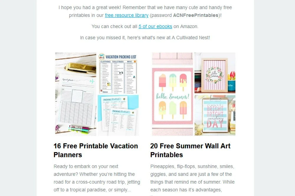
The A Cultivated Nest Newsletter, from spring 2021
Launch and Further Analysis
While I was designing the template, the newsletter team was working to import the A Cultivated Nest email subscribers and get everything set up. When they were finished, the new newsletter was used for the weekly Friday newsletter, and was quite successful. Click-through rates increased by 3%.
Over the next few weeks, I kept an eye on the Mailerlite analytics, and from analyzing that data I came up with further improvements the newsletter team could make:
Promote free content as much as possible, whether from ACN’s free resource library or in blog roundups of other website’s free content. Emails with “free” in the title had open rates around 4% higher than emails that did not promote free content.
Put free printables, organizing, cleaning, or frugal living content in the top left tile. On mobile, the template shifts to a single tile vertical display, meaning the most appealing content needs to be in the very first tile to avoid people deleting the email before reading it all.
Emojis in the email title did not increase or decrease newsletter open rates, but took up valuable character space (especially on mobile), so I recommended leaving them out.
Custom fill the email tagline instead of letting it auto-fill, and instead find a different way to describe the content mentioned in the main email title.
Use exciting adjectives in the email title. Emails containing words like “genius,” “super,” or “gorgeous” have around 3% higher open rates than emails without those types of words.
The newsletter team implemented my suggestions, and over the coming weeks saw a 10% increase in email open rates and 2 times the social shares.
Next Steps and Recommendations
Mailerlite has released several new features since I made my original template. Based on that, I would recommend:
Trying the new Mailerlite features and seeing how they affect subscriber engagement. In particular, the countdown timer could be used to promote ecommerce shop sales.
Testing the new features using the A/B split testing feature of Mailerlite.
Utilizing Mailerlite’s new surveys feature to run some simple surveys to learn more about how to improve other A Cultivated Nest KPIs.